Case Study · E-Commerce
Cristill Rock
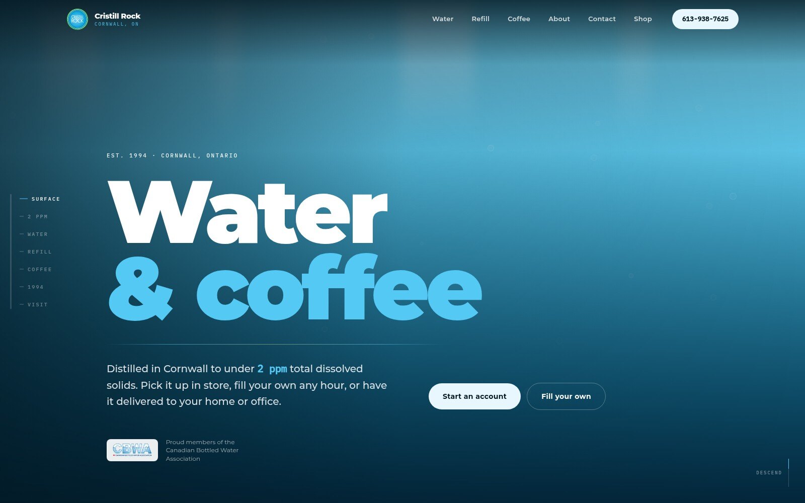
A self-initiated concept for a thirty-year-old water and coffee business — a page built as a descent through a water column, with a storefront on all 466 of their real products.
About this concept
This is a self-initiated design concept. Nova built it independently as an exploration of how a thirty-year-old water and coffee business could present itself online — it was not commissioned, and it is not affiliated with or endorsed by the company it reimagines. Product copy, pricing and the catalogue are drawn from the company's own public website; the three videos are their own, embedded from their YouTube channel. Atmospheric photography is AI-generated placeholder art standing in for a real shoot. The concept is served with noindex so it can never be mistaken for, or outrank, the real site.
The Problem With Water Websites
Every bottled-water site reaches for the same two props: a wave-shaped divider between each section, and three identical product cards. The original had both. Copying that at higher resolution would have produced a tidier version of the same page, so the first decision was to throw the wave dividers out entirely and find the story underneath.
The Thesis: A Measurement, Not A Mood
What this business actually sells is a number. They distil their signature water in Cornwall to under 2 ppm total dissolved solids — a figure they publish, and one almost nobody else in the category can claim. So the site is built as a descent through a water column: a single scroll-linked gradient that darkens with depth, breaks the surface into warm roast for the coffee half of the business, then resurfaces for the contact section. Depth encodes purity, and the coffee break-out is honest rather than decorative — coffee genuinely is the other half of the company, not a sub-category of water.
The Signature: Solids That Drain Away
Rather than set the number in large type with a small label — the default treatment for any statistic — the page renders a vessel of suspended dissolved solids that drain away as you scroll through it, until exactly two particles remain. The numeral is deliberately subordinate to the object. It is the company's own published figure, made physical.
Hierarchy Carried By Layout
Their three waters are not three equal cards. One they distil in-house; two they source. The distilled water gets a large feature panel and the sourced pair share a slimmer stacked column, so the layout states the hierarchy before the copy does. Elsewhere the restraint is in colour: the green pulled from their logo appears in exactly one section — the returnable-bottle story — so the colour itself carries the meaning. A serif appears exactly once, on the 1994 family history, which makes it read as deliberate rather than decorative.
Their Own Footage, Without The Tax
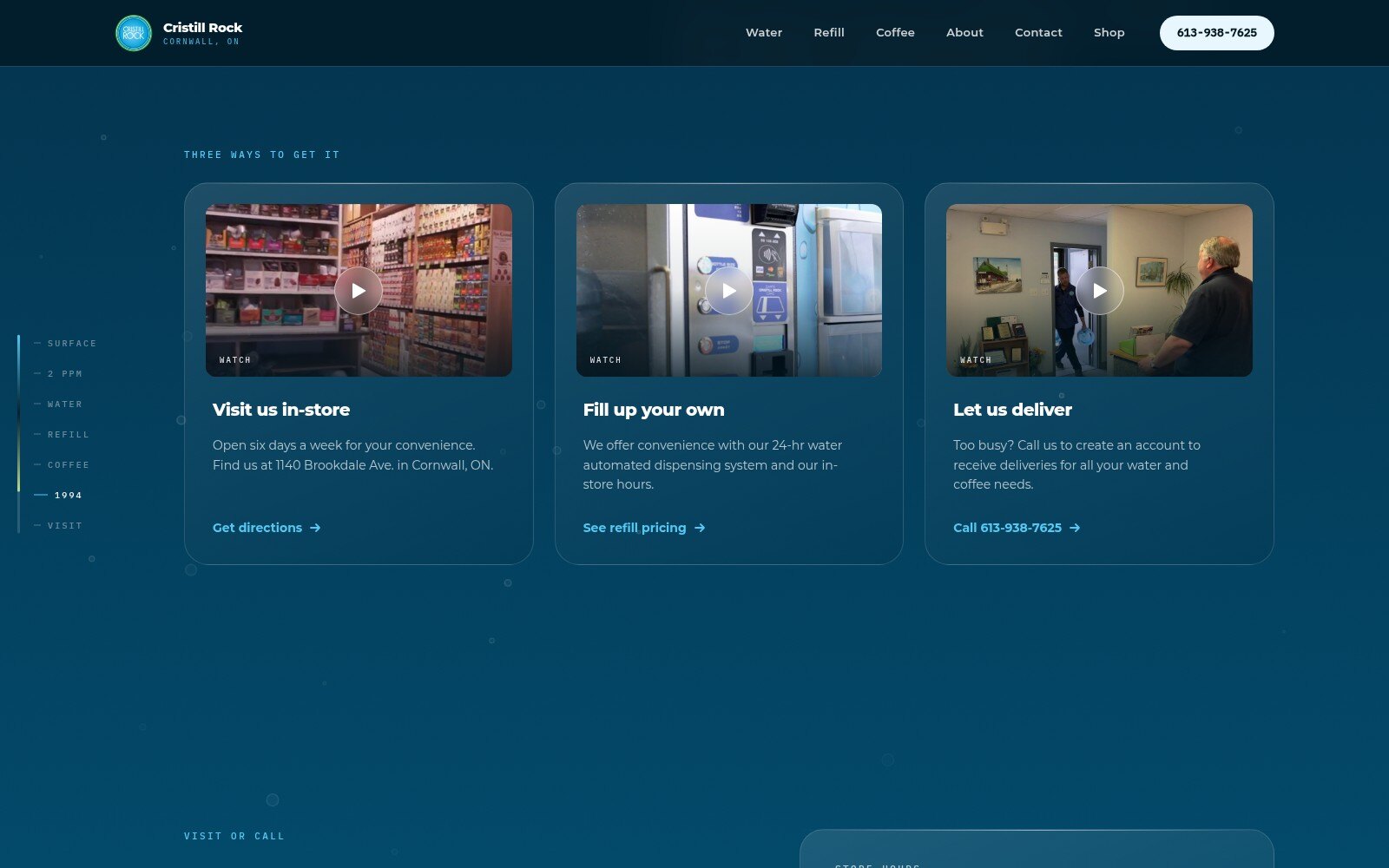
The company had filmed one short video for each way of buying — visit the store, fill your own, have it delivered — which maps one-to-one onto the three options, so those cards are video-led. Three live YouTube embeds would have pulled roughly 1.5 MB of player JavaScript and set third-party cookies before a visitor asked to watch anything, so each is a click-to-load facade over a self-hosted still. Nothing from YouTube is requested until the play button is pressed, and the embed then goes to the no-cookie domain. The published thumbnails all carry burned-in subtitles, so each poster is cropped past the subtitle strip and re-framed.
A Storefront On The Real Catalogue
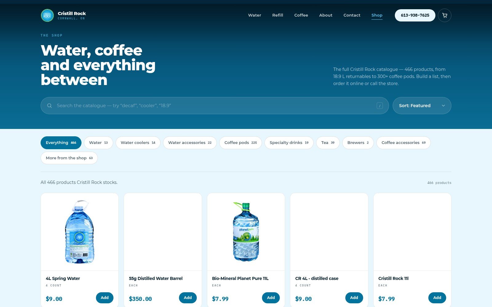
The concept includes a full shop built on the company's live catalogue — 466 products across eight categories, pulled from the JSON API behind their guest catalogue, with 416 product images self-hosted rather than hotlinked. It carries search across name, code and description, category filtering, a quick view with their own product descriptions, and a cart that persists between visits and hands off to their real ordering system rather than pretending to take payment.
Two things in the feed were deliberately left out. Seventy-nine products carry a promotional banner whose window had already closed, so rendering them would have advertised expired offers as current. And stock levels are internal inventory that would be stale the moment it was published. The shop shows regular pricing and no stock, and the two items with no price read "call for pricing" rather than $0.00.
Why The Shop Is Light
The storefront breaks from the dark water column into a light retail surface. That was not a style choice: every product photograph in the catalogue is a packshot on white, and a dark grid would have ringed each one in a grey box. The assets picked the palette.
Measured, Not Eyeballed
Contrast was measured rather than judged. The brand blue tests at 4.17:1 on white — just under the AA threshold — which had put every price and button label in the shop below the line, so the system gained a deeper companion token at 5.33:1 for small text on light surfaces while the original blue stays for display and decoration. The water gradient was darkened for the same reason after body copy measured 4.07:1 where the page resurfaces.
Key Features
- One continuous scroll-linked gradient replacing the stacked wave dividers of the original
- Scroll-driven purity vessel whose dissolved solids drain to the published figure
- Asymmetric product hierarchy that distinguishes what is made in-house from what is sourced
- Full 466-product storefront on the live catalogue, with search, filtering, quick view and a persistent cart
- Click-to-load video facades — no third-party JavaScript or cookies until a visitor presses play
- Self-hosted product imagery and video posters rather than leaning on the client's bandwidth
- Self-hosted variable fonts served from the application, with only above-the-fold weights preloaded
- Reveals driven by IntersectionObserver with a ticker-independent failsafe, so no element can be stranded invisible
- Reduced motion honoured throughout, visible keyboard focus, no horizontal overflow from 320px up
- Every measurement, price and opening hour set in a monospace face, so numbers read as data across both pages
Technologies: Laravel 13, Vue 3, Tailwind CSS 4, GSAP, Vite