TĒONAN · E-Commerce
TĒONAN
A Montreal functional-mushroom beverage brand, given a Shopify storefront with the same warmth as the product.
Who TĒONAN Are
TĒONAN is a Montreal functional-beverage brand — instant coffees, lattes, hot chocolate and teas built on a six-mushroom fruiting-body extract, adaptogens, and a probiotic engineered to survive boiling water. The proposition is deliberately unfussy: drinks that are, in the brand's own words, "as good for you as they are delicious." It rests on a piece of behavioural honesty they state outright.
"The only habits that stick around are the ones that you actually enjoy."
That belief sets the whole tone — playful rather than clinical, closer to a good café than a supplement aisle. The tagline tells you the rest: "It's SPORE than a feeling…"
Nova built the Shopify theme behind TĒONAN's Canadian storefront and has managed the store since. The catalogue has grown from the original 2021 coffee line into eleven SKUs — six beverage blends, a coconut creamer, two curated bundles, merch, and a Golden Milk Cold Brew added in June 2026.
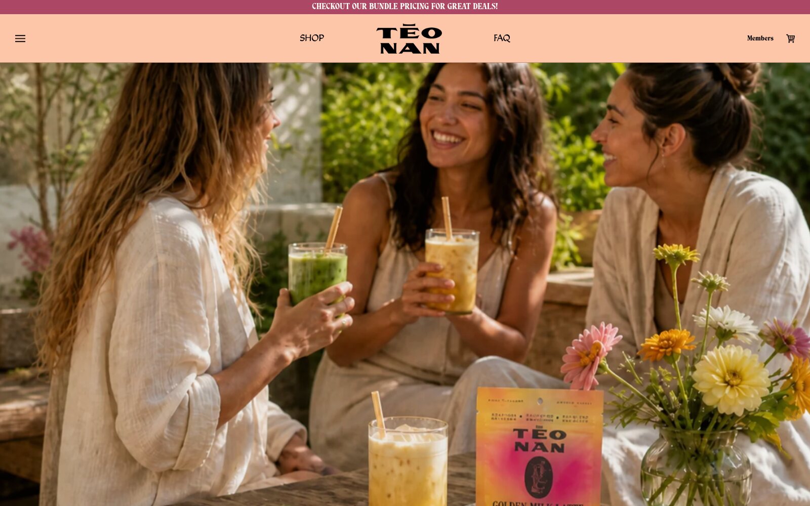
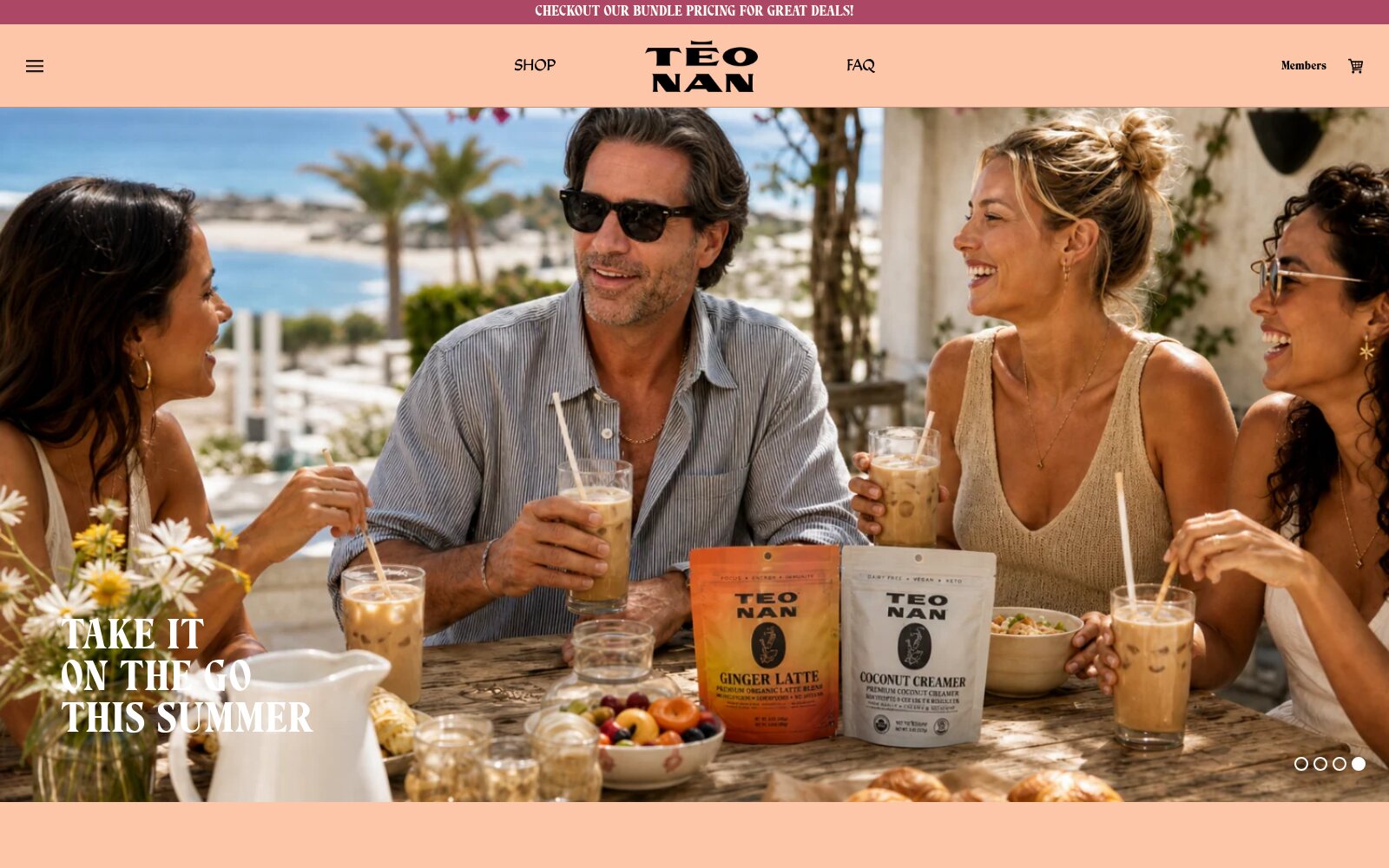
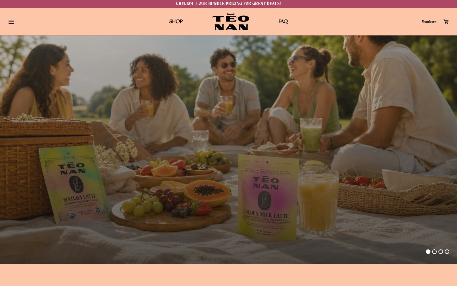
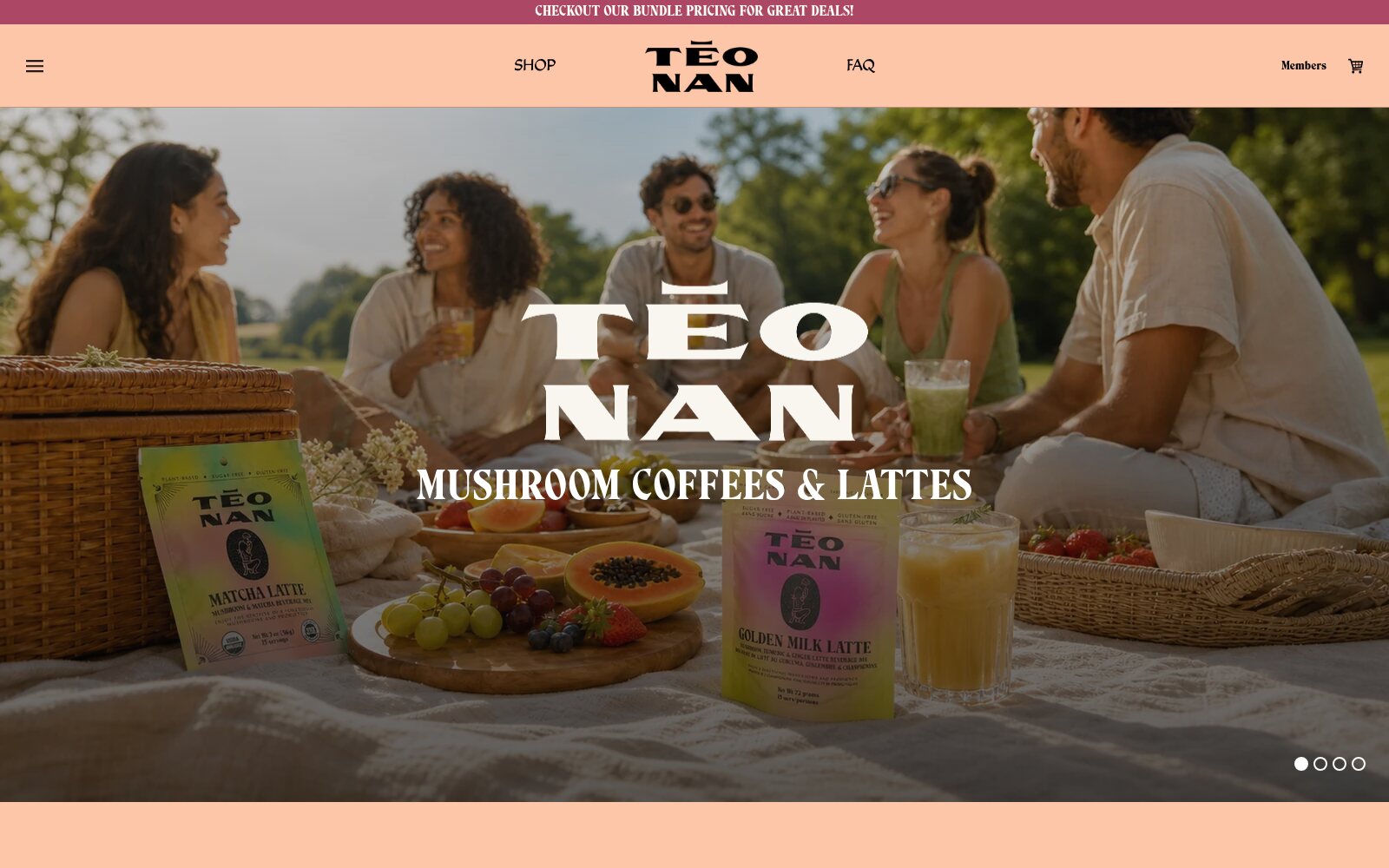
The storefront's four-slide hero, cycling as it does on the live site.
The Brand System
The palette is three notes and almost no chrome: a warm apricot that carries the header and the marketing sections, a bone cream for the shop itself, and black for every piece of type. A single wine tone is reserved for the announcement bar — the only place the site raises its voice.
#FEC6A9
Apricot — brand ground
#F8F6EE
Bone — shop surfaces
#AC4865
Wine — announcements
#000000
Black — all type
Typography does the heavy lifting. A high-contrast display serif sets product names and the stacked TĒO/NAN wordmark — the macron over the E is the brand's signature mark. Supporting text runs in a softer humanist face, with a condensed slab for the marquee statements. Three faces, no gradients in the interface, and all the colour left to the packaging.
The Catalogue
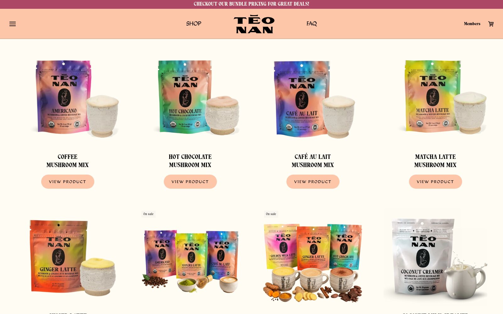
The product photography is where the brand spends its energy: every pouch is an iridescent gradient — magenta for Americano, coral for Hot Chocolate, violet for Café au Lait, lime for Matcha, orange for Ginger, silver for the Coconut Creamer — each shot beside the same speckled ceramic cup so the range reads as a set. Pack copy is bilingual on the physical product too: Made in Canada / Fabriqué au Canada, sugar-free / sans sucre, gluten-free / sans gluten.
Commerce Mechanics
Product pages are built to convert without shouting. Each one leads with the blend name in display type, a one-line description of what it actually is, then the decision: one-time purchase or subscribe and save 20%. Sold-out variants swap the buy button for back-in-stock email capture rather than a dead end, and a short benefit checklist answers the objection every mushroom-coffee buyer has — no mushroom taste.
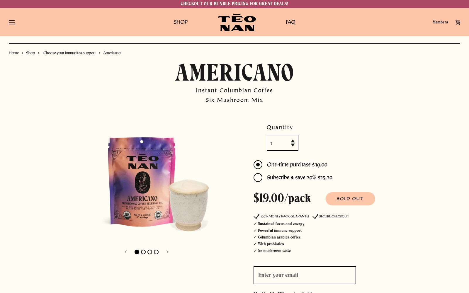
- Subscribe-and-save at 20% off, offered inline against the one-time price
- Curated bundles — Energizing Caffeine and Sleep Well — merchandised as their own SKUs
- 15- and 30-serving collections so the same blend can be sampled or stocked
- Back-in-stock notification capture on sold-out variants
- Free shipping over $50 across Canada and the US, 3–10 day delivery
- Money-back guarantee and secure-checkout assurances at the point of decision
Bilingual by Default
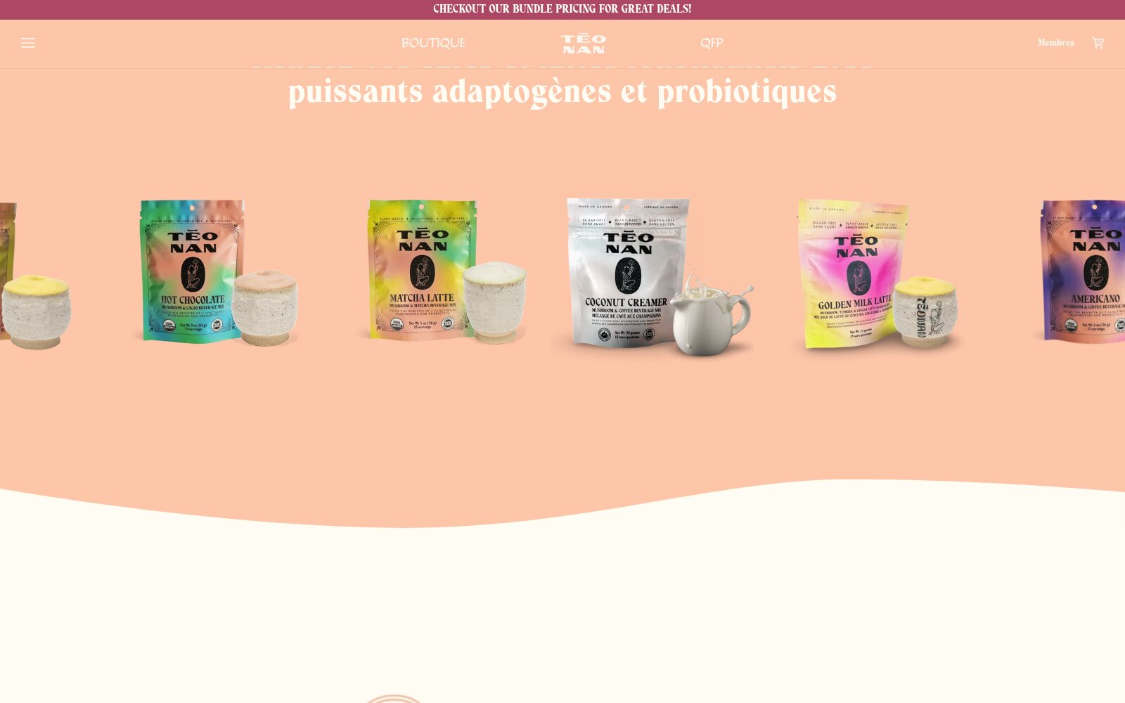
The store runs fully in English and French — not a language toggle bolted onto an English site, but parallel routes with their own sitemaps, translated navigation (Boutique, QFP, Membres) and translated marketing copy throughout. For a Quebec brand selling to both Canada and the US, that is the difference between a storefront that reads as local and one that reads as imported.
What's Actually in the Cup
The product claims are unusually specific for the category, and the storefront is built to carry that detail without burying the buy button:
- Six functional mushrooms per blend, fruiting bodies only — never mycelium grown on grain
- 200 mg of a 10:1 dual extract per serving, equivalent to 2,000 mg of dry fruiting body
- Dual extraction — water then ethanol — to pull both water- and alcohol-soluble compounds
- A heat-resistant Bacillus coagulans probiotic that survives boiling water
- Extracts sourced from NAMMEX in British Columbia, greenhouse-grown on natural substrate
- Certified organic (ECOCERT, USDA, Organic Canada), vegan, gluten-free and GMO-free
- A caffeine ladder rather than one level: 80 mg in the coffees, 60 mg in matcha, 5 mg in cacao, and caffeine-free herbal blends
Nova's Role
Nova built the custom Shopify theme and has run the store as an ongoing engagement since 2021 — theme development and iteration, the bilingual storefront, catalogue and merchandising as the range expanded, subscription and bundle setup, and day-to-day store management.
Technologies: Shopify, Liquid, SCSS, JavaScript, Flickity, Klaviyo